

Psycho
Cult Poster

Brief
Cult Movie Poster
Year
2020


For this brief, we were asked to create our own movie posters for a movie of our choice (from a pre-selected list, of course). As a horror movie fan, I immediately knew I would be designing a new look for Alfred Hitchcock’s 1960 classic film, “Psycho.”
We had to create both a reimagined movie poster for a specific target audience and a “cult” movie poster more geared towards superfans. For each movie poster, we had to first create a handmade version which we later had to re-create digitally. This page displays my reimagined poster and the process behind its creation.
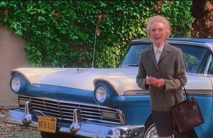
Catering to the cult following was my first priority, so I felt that the design had to honor the superfan’s attention to detail. I chose to depict the classic car-sinking-in-the-bog scene, not only because it would be instantly recognizable to any fan of the film, but also because the license plate makes for an excellent piece of “Psycho” trivia.
The Process

Typography
As in the reimagined poster, I decided to lean on yellow for the lettering since color psychology indicates that it can evoke feelings of danger, fear and anxiety.
For the title type, I concentrated on the paper cutout lettering style of Saul Bass, who created the opening credits for “Psycho” and many other popular movies of the time. Since we are dealing with superfans, it felt right to draw inspiration from the original creatives.

Image Making
In an effort to imitate a retro handmade style for this poster, I mostly used gouache and acrylic paint to create the bulk of the imagery, with yellow paper cutout to create the lettering.
Since the movie is black and white, I was able to play around with color without feeling like I’d necessarily be inviting trouble from the die-hard fan’s scrutinizing gaze.
I brought a yellow gradient into the background to compliment the type and to give the atmosphere a sinister, foreboding glow. I made the tail lights bright red and slightly exaggerated the angle of the decorative wingtips on each light in an effort to hint at a set of evil eyes.


For the car, I sketched out the bog scene and made several photocopies so I could experiment with different color combinations. In the end, I landed on a blue and white paint job. The blue not only looks nice and ties together the primary colors in the poster, but it is also a nod to the easter egg 1957 Ford Fairlane that re-emerges (with the same license plate!) in the 1998 “Halloween” film starring Janet Leigh and her daughter, Jamie Lee Curtis.

The very first thing I did was scan in the old poster and isolate the car painting, which I touched up using digital paintbrushes in Photoshop. Next, I created my own textures and brushes in Photoshop by scanning in watercolor and lino ink marks that I made with brushes and sponges to create grassy, bog-like textures. The eerie yellow to black foggy gradient was achieved using the blend tool.
Check out the two finished posters below to compare the handmade and digital final pieces.
Digitizing the Final Design

Handmade Original

Digital Recreation